Color Systems That Actually Work
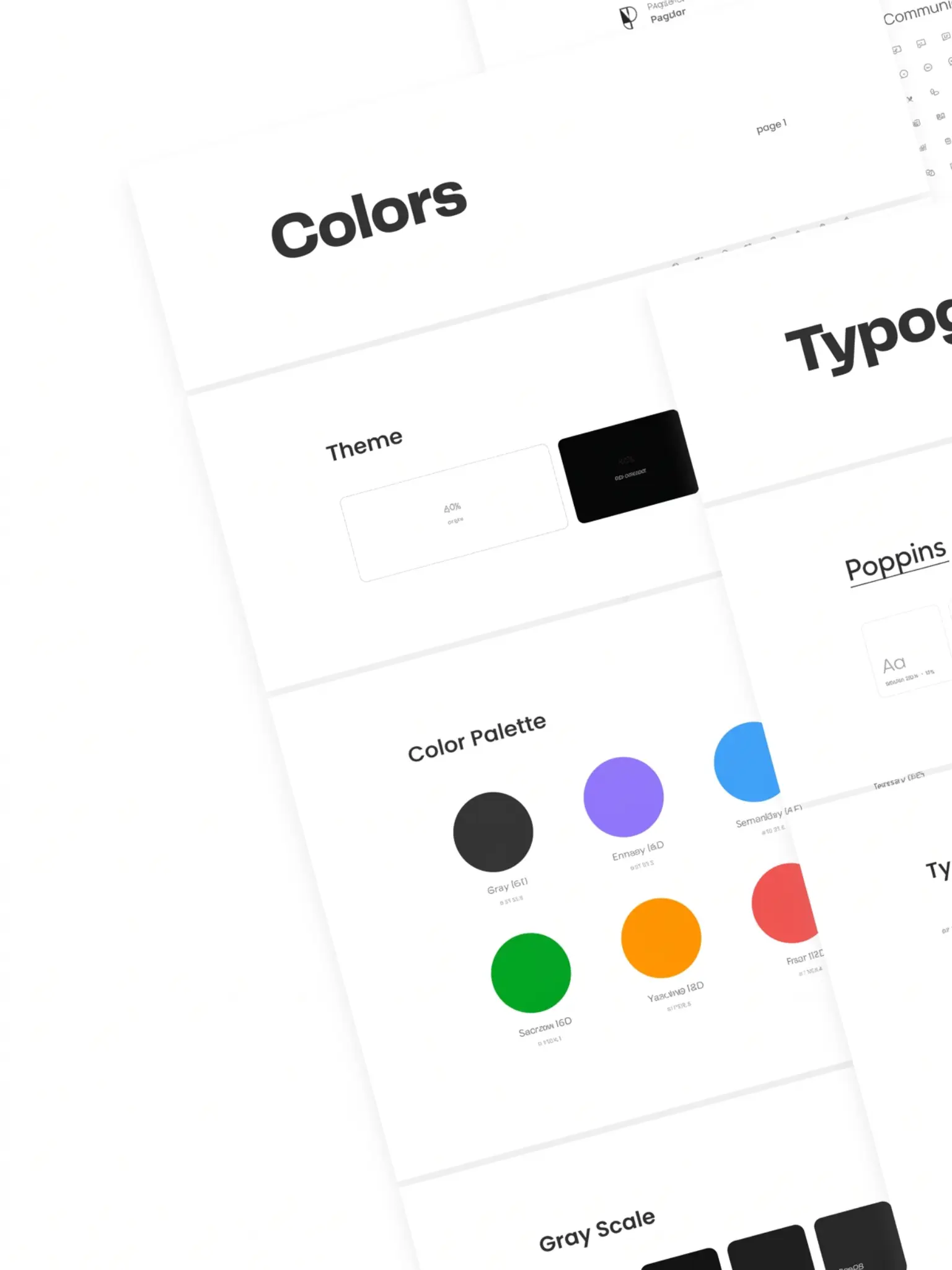
Picking five brand colors and calling it a palette is where most projects start. It's also where most color problems begin. Five colors aren't enough to handle every state, every surface, every context a real application throws at you. Hover states, disabled inputs, error backgrounds, success banners, skeleton screens, a real interface needs dozens of color decisions, and a flat palette forces designers to improvise.
A color system is different. It defines relationships, not just values. A background color implies a foreground color. A surface color implies an elevation. A semantic token like 'danger' resolves to different values in light mode and dark mode, but the intent stays the same.
We build our color systems on two layers: a primitive scale (the full range of each hue) and a semantic layer (what each color means in context). The primitive scale rarely changes. The semantic layer adapts to themes, modes, and brand updates without touching a single component.
The test of a good color system is simple: can a new developer join the project and make a color choice without asking anyone? If the tokens are clear enough, they can. If they're reaching for hex codes, the system has failed.